This design was created for the guys on the LaSalle Fire Department as a t-shirt graphic. Firefighters are not allowed to wear the shirts they wear on calls while they are off duty or at a bar/restaurant. Which is why they wanted this design created; They can rep their department and job while casually out.…
Working with Kaitie was an absolute pleasure. Throughout the design process, she was incredibly attentive, responsive, and open to feedback. Her dedication to ensuring that the final product met my vision was truly commendable. Kaitie made the revision phase effortless and enjoyable. I couldn’t be happier with the end result and the seamless collaboration. I…
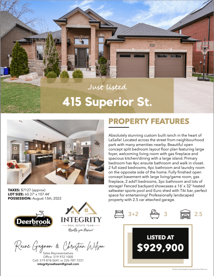
Custom flyers for Integrity Real Estate Team at Deerbrook Realty Every flyer was made to fit the property and what it offered. These flyers were printed and given out to potential buyers at open houses that were looking for information on the property. Clean, easy to understand and on-brand for Integrity.
Logo design from 2022 Rough sketches are always done traditionally first – taking into account the style and overall vibe the client was looking for. Next were digital roughs each with a different style created in Adobe Illustrator The client decided to expand more with option #2 in different colour schemes. Colour options fun to…
These Social Media posts were done for a Facebook Game Page created by iDream Interactive called Recipe Rescue Fruit Blast. To create these posts I spent time researching the previous things that were created and posted on the page, as well as: Audience age Audience gender Most active follower times (best times to post on…
All video work was done in Adobe After Effects Video was a concept for the company’s Header Video on their page, to act as an introduction to viewers and give insight into iDream’s values & ideas.
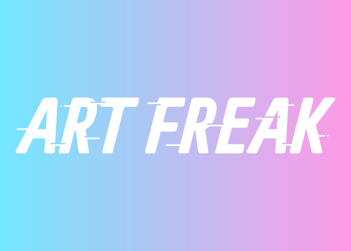
Art Freak is a design created to help transform my personal brand. I took inspiration from a new colour scheme that is bright and modern feeling. I altered the text to become more rounded around the corners to better suit the overall feel of the typography. It is very rare that I have projects only…
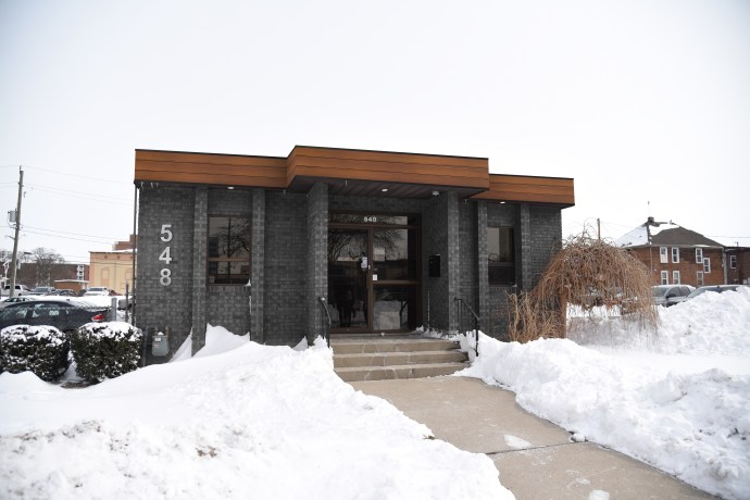
The Windsor Police Association is a Professional Association representing police officers working for the City of Windsor. They were looking to update the current look of their building, while keeping it conservative but with a modern flare. The Before Front overhang of shingles makes the exterior look very dated. The brick on the front will…
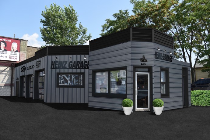
The Before Basic white and red siding, all facing horizontally. Mixed and matched signage with minimal modern decals. Unused window section, limited access to inside the building. Little to no exterior lighting outside/in-between bays. Blue bay doors letting in minimal light. Suits the previous red and blue theme, but is not very modern. The Mock-up…