The Before

Basic white and red siding, all facing horizontally. Mixed and matched signage with minimal modern decals.
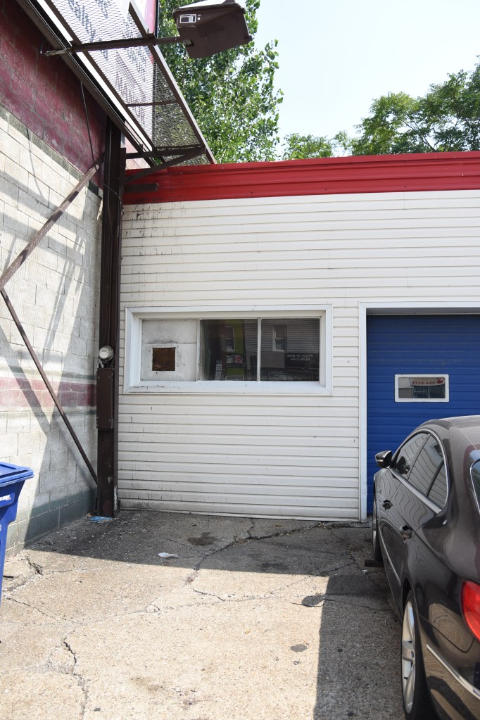
Unused window section, limited access to inside the building. Little to no exterior lighting outside/in-between bays.
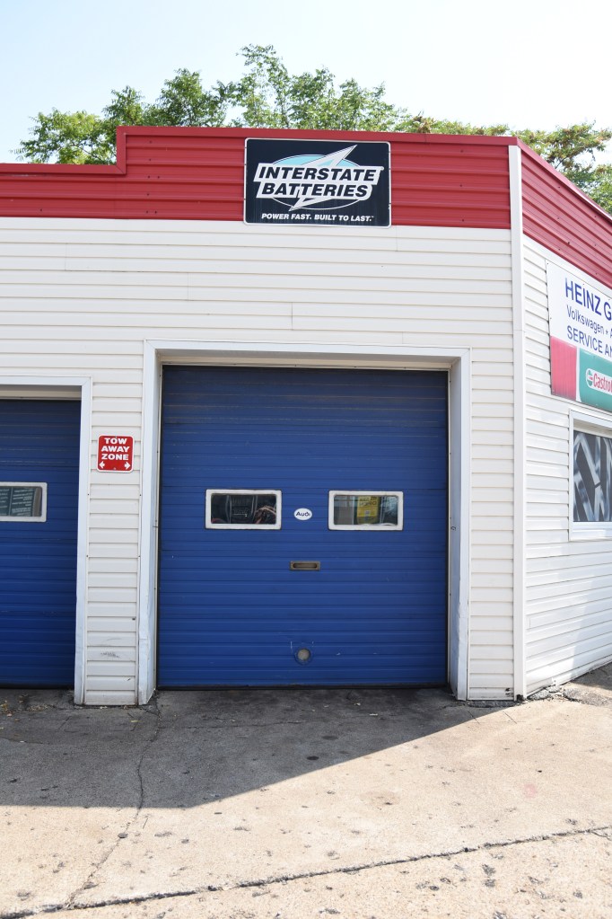
Blue bay doors letting in minimal light. Suits the previous red and blue theme, but is not very modern.
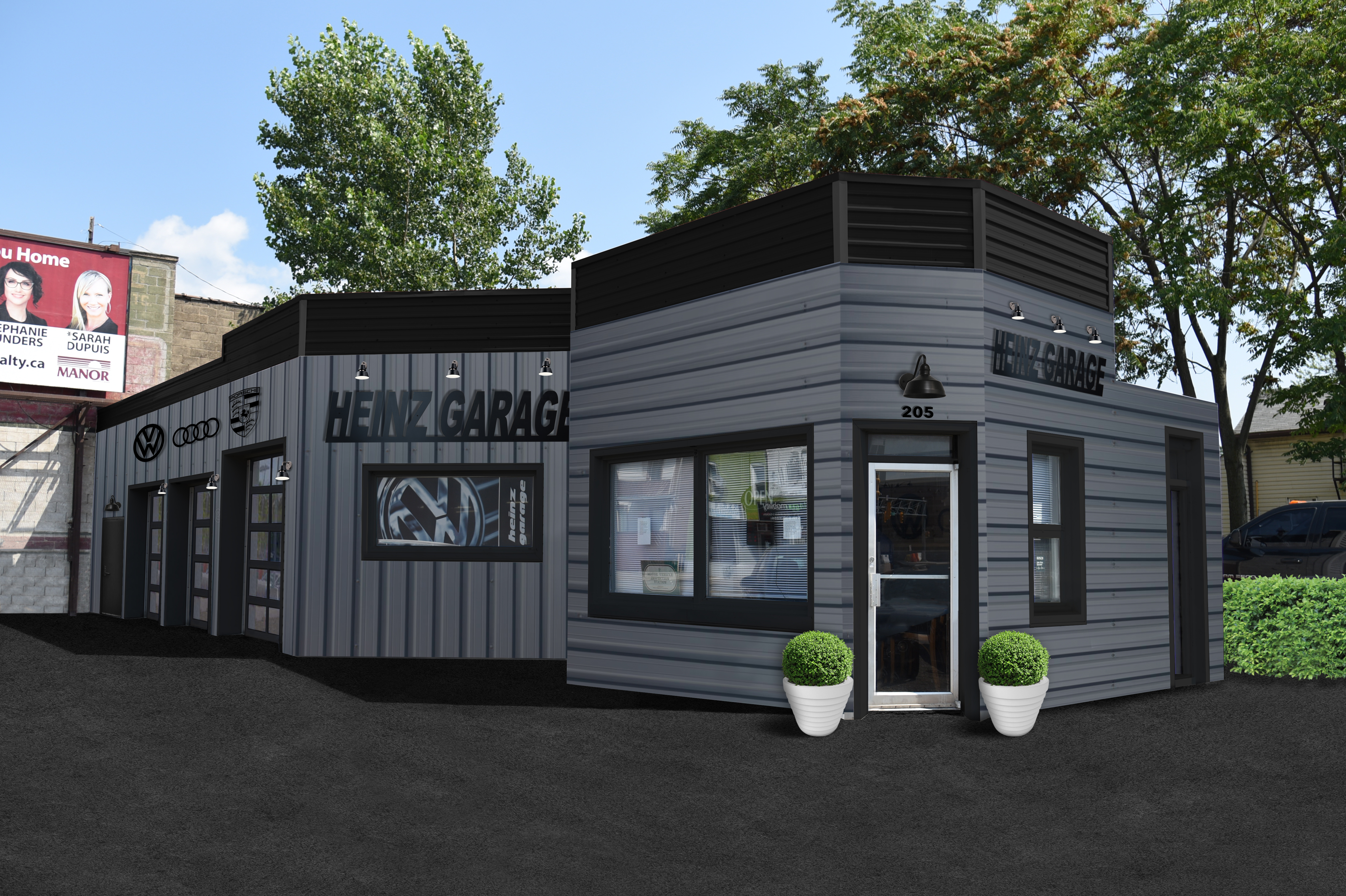
The Mock-up Design
Black and Grey steel siding, with all black trim to bring together a cohesive modern theme.

New signage to bring together the look from inside the building. Horizontal and vertical siding to bring dimension and differentiate office from auto shop.

Door added at back for more access, as well as industrial black lights in-between bays. New bay doors with more windows and car brand signage to match interior and for aesthetics.
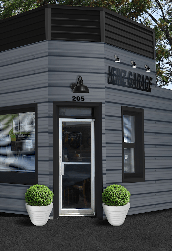
The After

The design has come to life! Signage, colour scheme and small accent details bring the whole modernized look together.
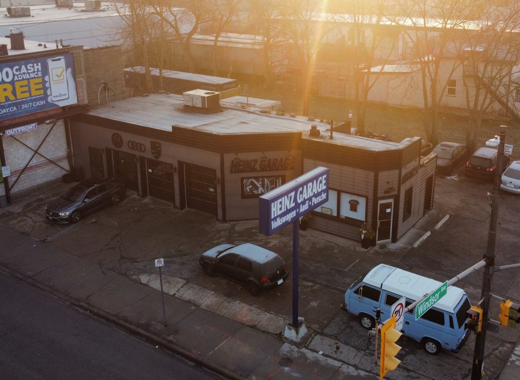
View of the whole new design after completion. The second single door has been added to the left side of the building, as well as the other finishing details on the far right side.